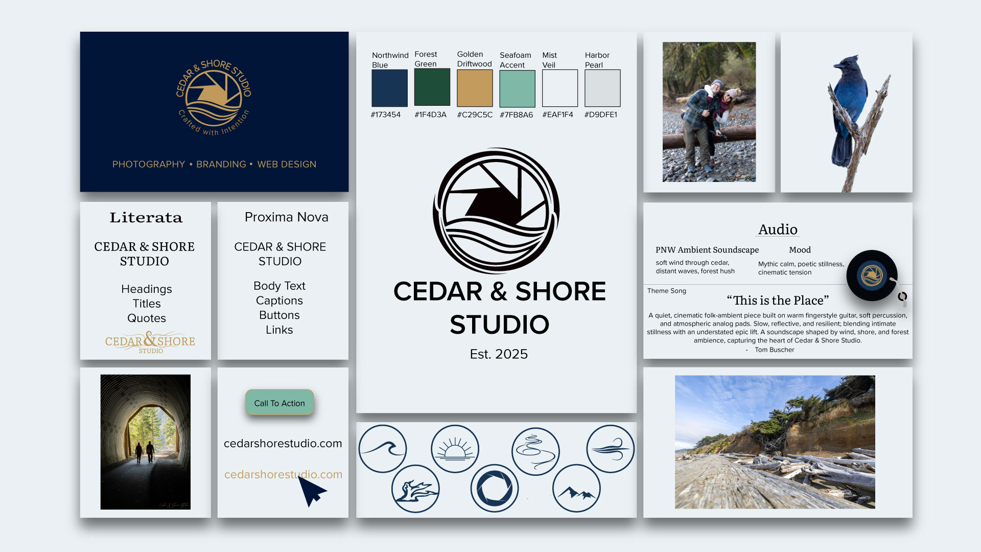
Brand design is the visual structure that shapes how a business is recognized, remembered, and trusted. Cedar & Shore Studio creates intentional brand visuals that help businesses present themselves with clarity, consistency, and professional value.
This work includes logo design, color direction, typography, visual identity systems, marketing materials, and brand assets created to support websites, print materials, social media, and long-term business growth. The goal is not decoration. The goal is to create a brand presence that feels established, credible, and aligned with the value of the business.
Logo & Identity System

This logo and identity system displays the Cafe Espresso brand in multiple usable formats, including a primary logo, secondary logo variations, a social icon, and a coordinated color palette. It shows how one brand can remain consistent while still having enough flexibility for different uses.
The process includes developing logo variations, simplified marks, typography direction, color choices, and layout options that work across web, print, packaging, social media, and small-format applications. The value is brand consistency. A complete identity system helps a business look organized, recognizable, and professionally established instead of relying on one logo for every situation.
Brand Identity Mockup

This brand identity mockup shows the Cafe Espresso logo applied across realistic business materials, including a coffee bag, mug, business card, and branded apparel. Presenting the identity this way shows how the logo, color palette, and visual style would function beyond a flat design file.
The process focuses on testing whether the brand feels believable, consistent, and production-ready across different customer-facing items. The value is practical clarity. A business can see how its brand will appear in real-world use before investing in packaging, printing, merchandise, signage, or marketing materials.
Print & Marketing Design

This print and marketing design presentation shows a Cedar & Shore Studio client-facing brochure as a branded print collateral mockup. The layout demonstrates how photography, messaging, typography, and brand identity can work together in a polished physical format.
The process focuses on visual hierarchy, readability, service communication, image selection, print layout, and customer experience. The value is stronger communication. Well-designed marketing materials help a business explain its services clearly, guide customer decisions, and leave people with something professional, memorable, and aligned with the brand.
Packaging Design

This packaging design shows a complete Nebula Bites candy box layout, including the front panel, side panels, nutrition-style information, flavor callouts, product graphics, and print structure. It demonstrates how a product concept can be turned into a full package design that feels ready for presentation or production.
The process considers color, typography, product personality, hierarchy, required information, print layout, and how the design will look in a customer’s hands. The value is immediate perception. Strong packaging helps a product feel more credible, memorable, and purchase-ready before the customer ever experiences what is inside.
Infographic Design

This infographic design shows a custom skills wheel built around creative services, software knowledge, photography, video, web design, branding, and digital production capabilities. Instead of presenting the information as a plain list, the design organizes it into a structured visual system that is easier to scan and understand.
The process focuses on simplifying complex information, building hierarchy, balancing text with icons, and creating a layout that communicates quickly. The value is clarity. Infographics help businesses explain services, processes, capabilities, or data in a way that feels professional, organized, and easier for viewers to remember.
Logo Mark Design

This logo system shows multiple Cedar & Shore Studio logo variations designed for different brand applications, including primary logos, secondary marks, submarks, and favicon options. The system includes both black and gold versions, allowing the identity to remain consistent across websites, print materials, social media, watermarks, signage, and small-format uses.
The process focuses on flexibility, hierarchy, scalability, and brand consistency. A complete logo system gives a business more than one usable logo. It creates a visual toolkit that can adapt across platforms while keeping the brand recognizable, polished, and professionally established.